Redesign UI and Information Architecture for a training presentation in the field of ergonomics of Ergonomic internal departmen. This redesign aims to enhance clarity and usability, ensuring effective delivery of ergonomic principles and practices to participants. The training is conducted once per year to update staff on the latest ergonomic standards and methodologies.
Responsibilities: User pain point research, definition main user flow, conducting usability studies and iterating on designs, Graphic Design, Coding in Action Script 3.0.
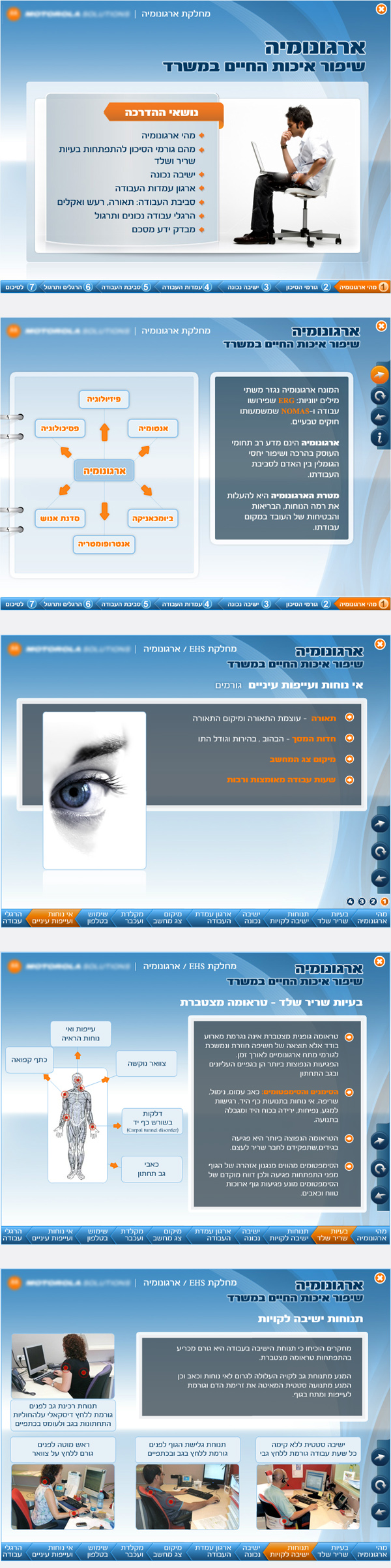
Rearrange the IA and Redesign old presentation
The employees of Company
Adobe Photoshop, Adobe Flash, Action Script 3.0
Non-friendly and confusing navigation, visual visibility of the previous learner presentation was unfriendly - black screen, screen resolution and dimensions unclear, images do not load. There is no clear and intuitive interactive script
User pain points did known from telephone conversations of few employees with manager of the Ergonomics department: Miri: "How do I go back one screen forward to see what I'm being asked on this screen?" Haim: "If it's mandatory to go through a school every year, then why don't we go through it with fun. Is there another school?" Rafi: "Are there any exercises for the eyes?" Summary: Inconvenient navigation, not fun visual visibility, hard to find a certain topic
Redesign a presentation based on a company's BRAND BOOK, redefine information architecture, emphasize interaction between the user interface
To build a clear architecture of all the material - files and text, define user-friendly navigation, create a prototype, pass tests with a group of volunteers to company employees
Proof that the user really went through all the learning
Create an additional interface at the end of training presentation with "passed/failed learning" check. Purchase/learn tools to perform this.
User testing results. Usability study: findings. I conducted two rounds of usability studies. The results of the first study helped to create a useful and user-friendly menu and sub-menu, rearrange AI. The second study helped to identify which aspects of the layout needed improvement, adding of paginator in item.
1. User has trouble with organize infirmation step by step 2. Depatmen has added text and media
1. The user has difficulty due to the large amount of information on one page 2. User has trouble with illustratins and media
#UX/UI #InformationArchitecture #BrandingBOOK #Identity #Graphic Design #HTMLSolutions #FrontEndSolutions #AS3Coding #InteractiveDesign